

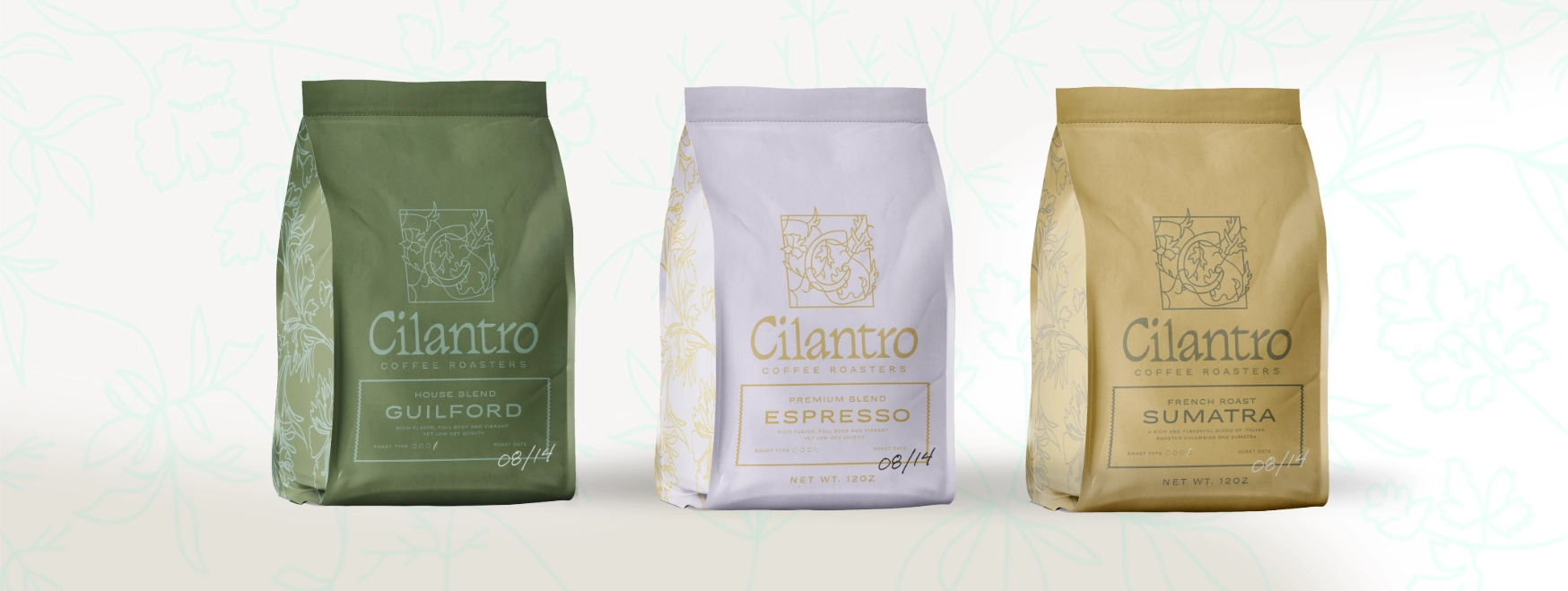
Cilantro Coffee Roasters
Taylor Schultz
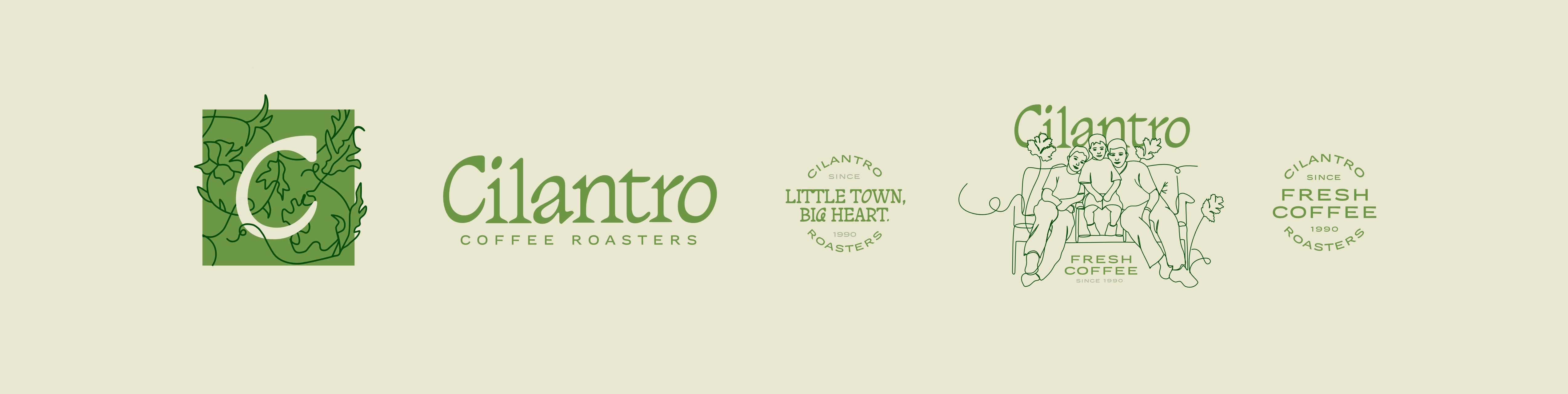
Cilantro has roasted coffee on Guilford's Main Street since 1990. Their logo had history and recognition on its side, so the brief wasn't a rebrand. It was a careful update: sharpen the mark, keep what regulars already knew and loved, and give it room to grow.
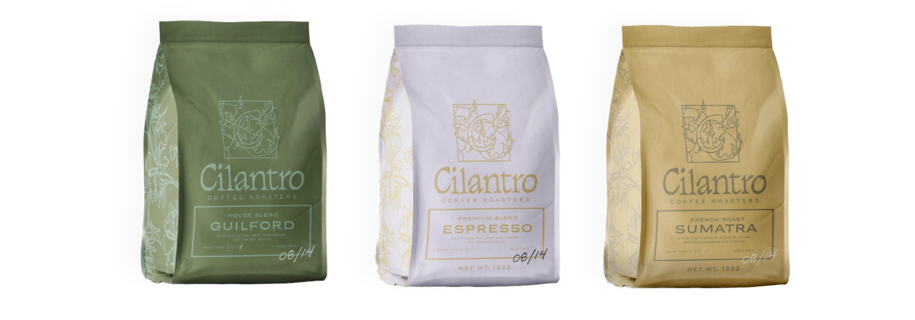
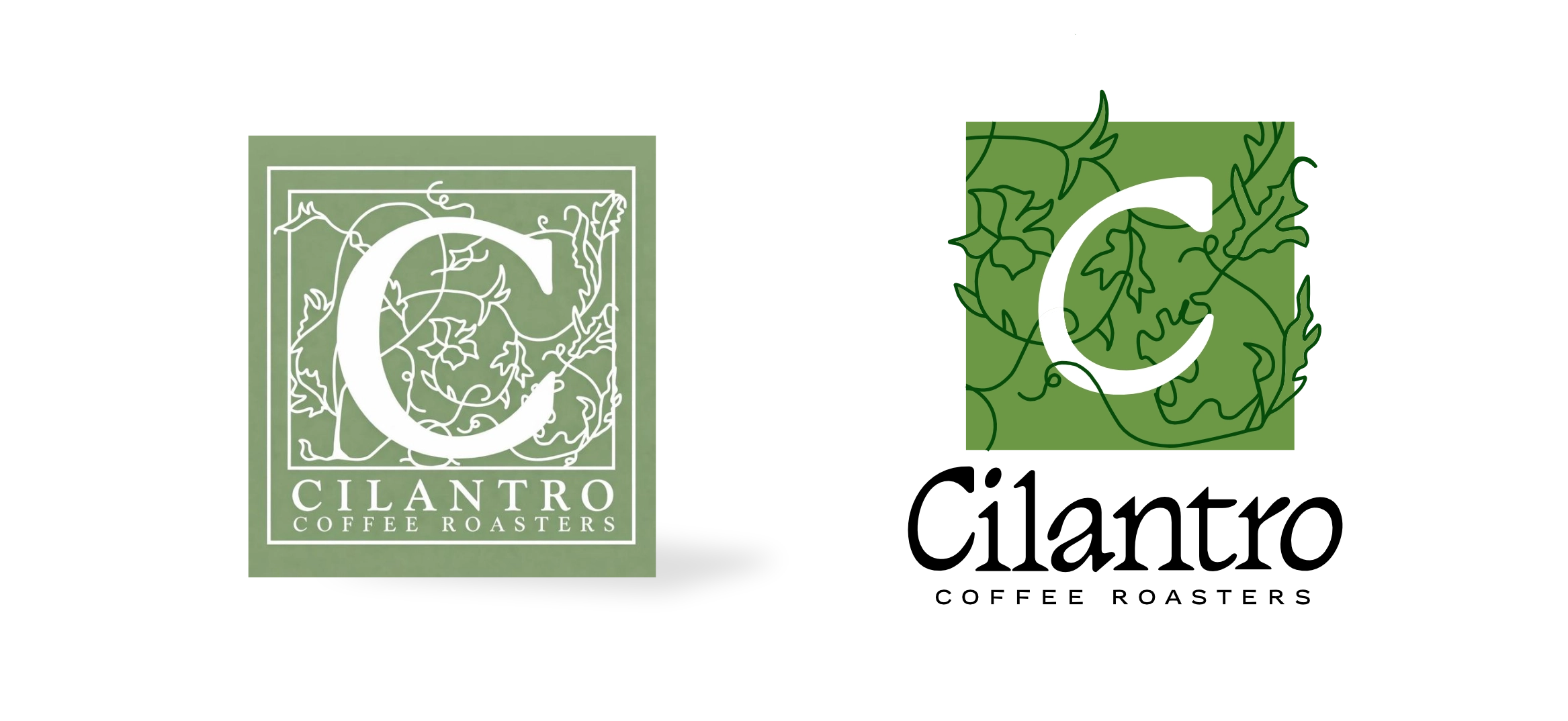
The heart of the identity is Cilantro's square-frame "C" monogram, wrapped in illustrated leaves. I kept the shape people recognize and rebuilt it: a refined leaf frame and new, better-matched typography that give the mark new life without making it feel like a different business.
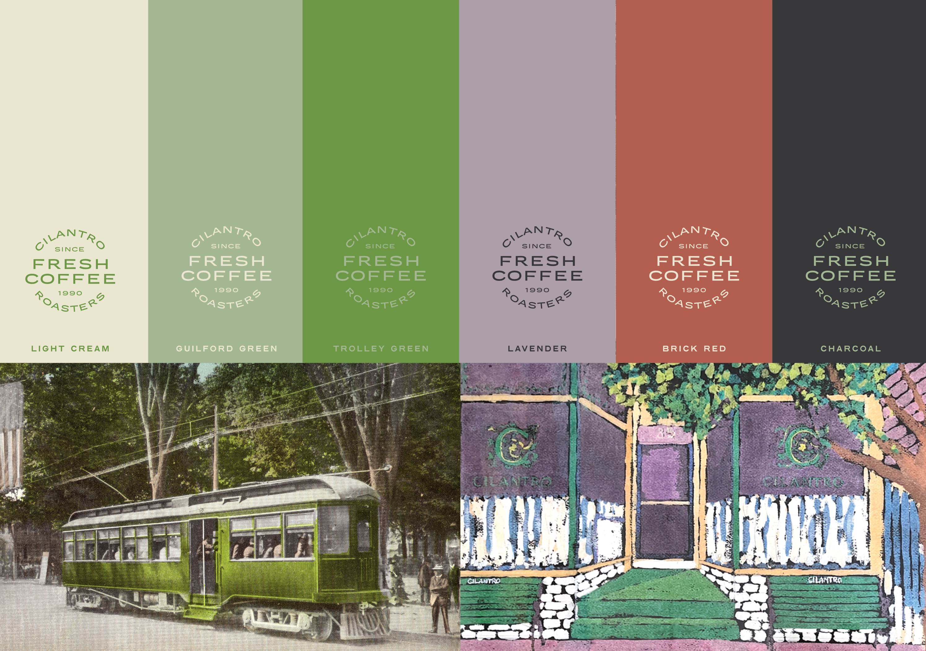
Around the logo, a complementary color palette and a set of illustrated elements drawn from Guilford's own iconography and community art, so the brand feels rooted in the town it belongs to, not dropped in from anywhere.
We also brought in a tagline that captures the whole thing: "Little town, big heart."