


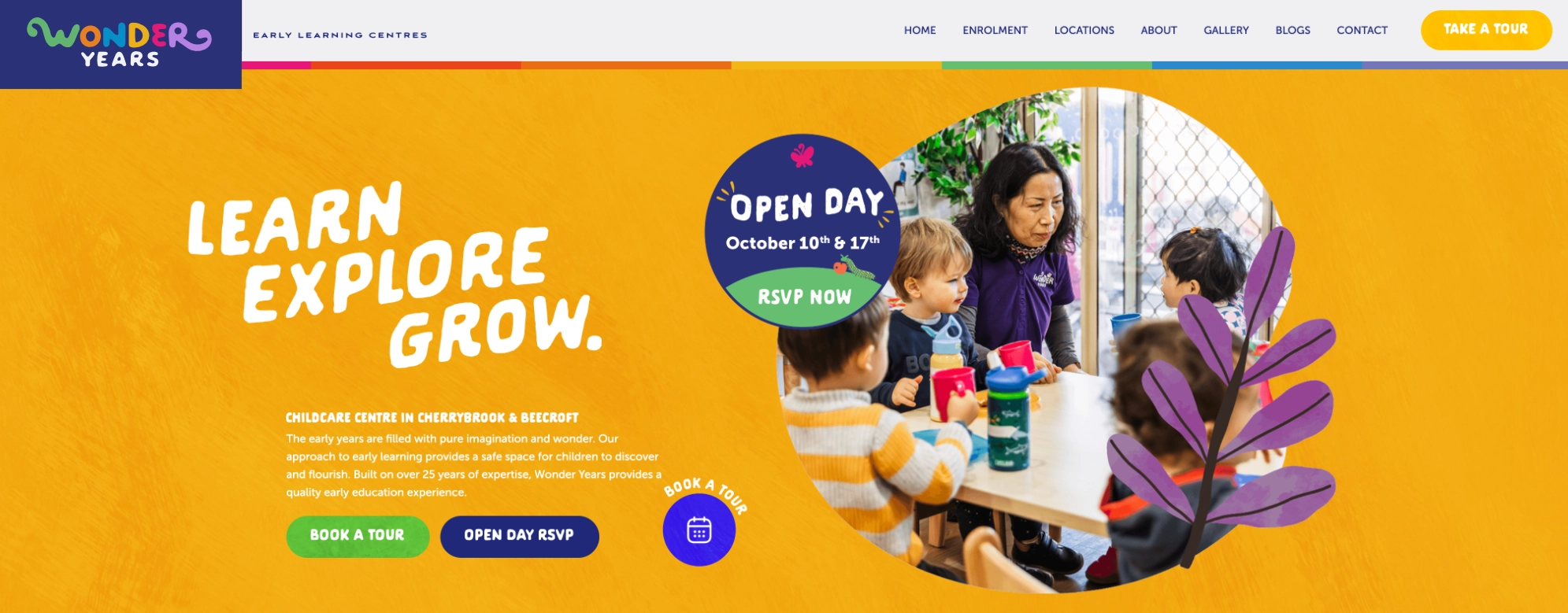
Wonder Years Preschool
Taylor Schultz
Wonder Years Preschool was under new ownership and wanted a cohesive, bright identity across every center, built to stand out in a category that mostly looks the same.
The heart of it is their learning philosophy, which is built on the idea of metamorphosis — kids growing through stages the way a caterpillar becomes a butterfly. So the whole brand runs on that: the three age-group rooms are named Caterpillar (the babies, new to the world), Chrysalis (toddlers finding independence), and Butterfly (preschoolers ready to spread their wings).
From there I built out a warm, playful identity system bright enough to feel joyful. The goal was a brand that earns a parent's trust on first look but is still welcoming and friendly for young learners, because choosing where your kid spends their days is about as high-stakes as decisions get, and the brand has to feel as caring and capable as the people behind it.
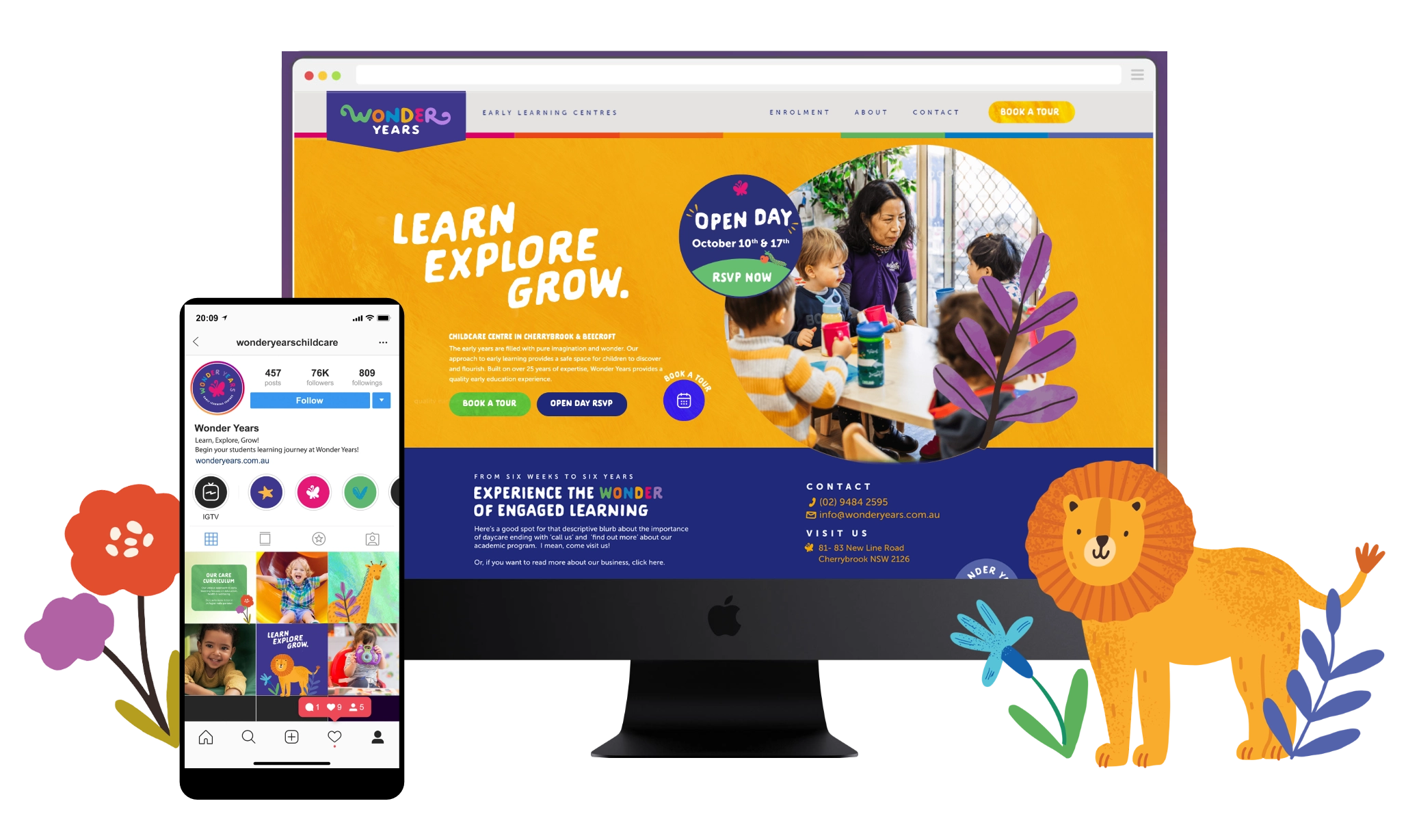
Full case study coming soon.